Delivery Data Visualization
This is a Refocus Task. As a data analyst in an Indian delivery company, I have been tasked by top management to create a report on delivery time to compare the company's performance with competitors in Asia. The report will use data from a .csv file that includes information such as delivery time, order date, traffic, weather, location, and other relevant factors. The company delivers various items, including entrees, sides, drinks, desserts, and groceries, using cars, bikes, or motorized scooters, depending on the location. The report will aid in expanding the company's business to other countries in Asia.
Power BI Dashboard
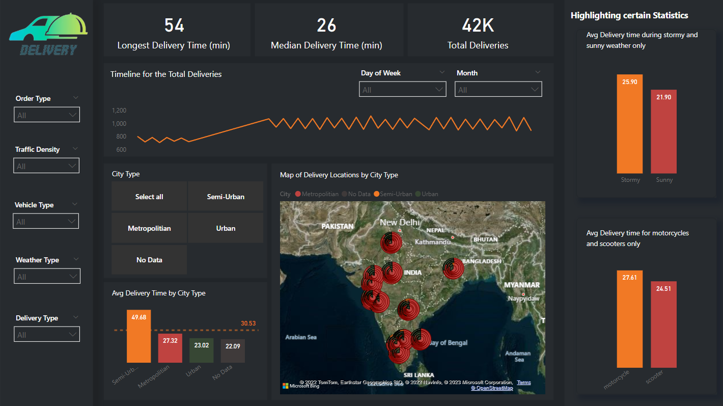
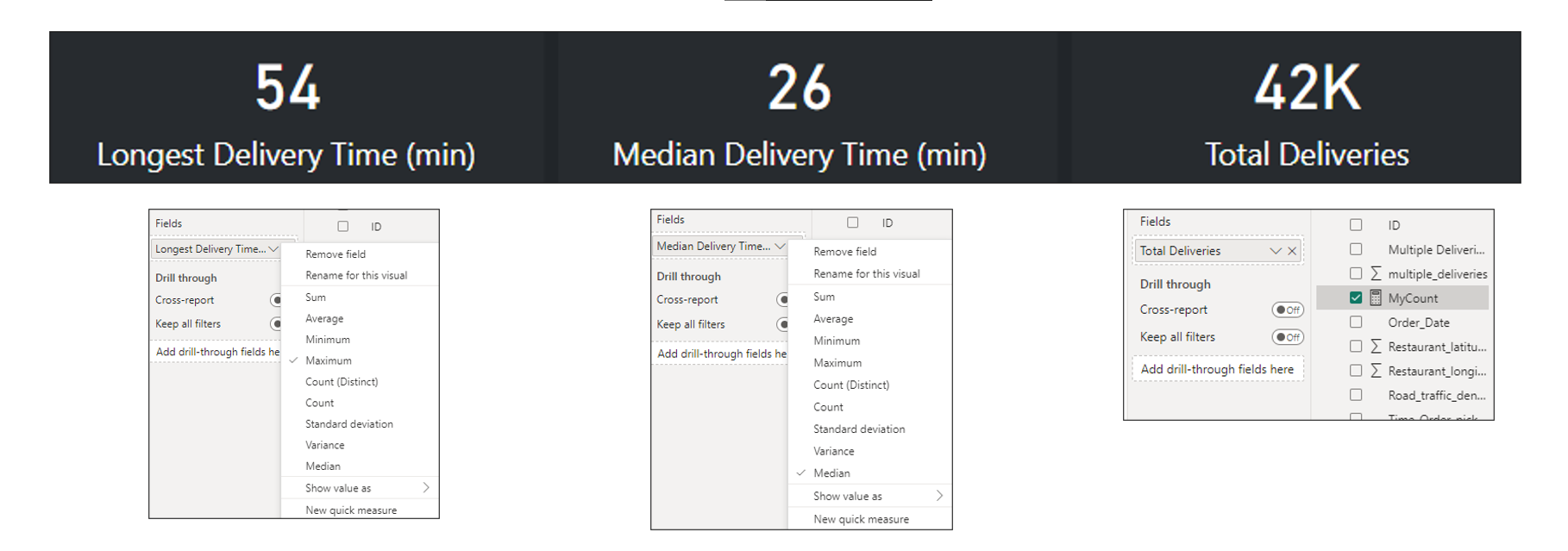
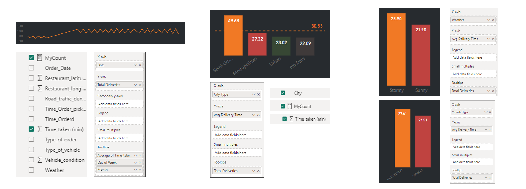
This dashboard presents key performance indicators, including the longest delivery time, median delivery time, and total number of deliveries as specified by management. These metrics are displayed in number cards that dynamically adjust as users apply various filters available on the left-hand side of the dashboard. The right side of the dashboard features a comparison of average delivery time during different weather conditions and modes of transportation (i.e., motorcycle vs. scooter) to help address the business question of which mode of transportation is more efficient in larger cities where homes and restaurants are closer together. The center of the dashboard features a map of India, showing the total number of deliveries per city type (semi-urban, metropolitan, urban). Additionally, a timeline shows the total number of deliveries over the period of analysis, which can be further filtered by day of the week and month.
Methodology
Dataset Review
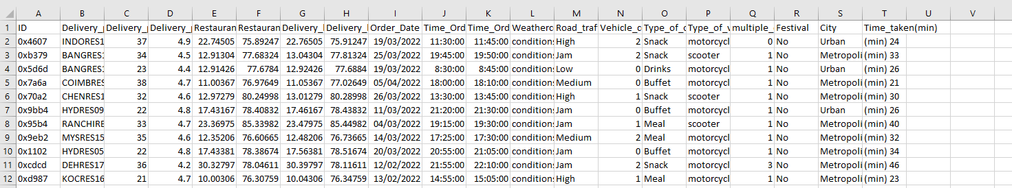
Upon reviewing the dataset in Excel, I have determined the necessary metrics for the analysis. Utilizing the "ids" column, I will generate a "DeliveryCount" metric, while the order dates will form the basis of a timeseries graph. In order to focus solely on the information related to location, weather, vehicle type, and lead time, I will exclude irrelevant columns such as "Delivery_person_ID", "Delivery_person_Age", and "Delivery_person_Ratings". The "Vehicle_condition" integer and "Festival" binary columns will also be dropped. Additionally, I have identified a range of filters to be incorporated into the dashboard, including "Order Type", "Traffic Density", "Vehicle Type", "Weather Type", "Delivery Type", and "City Type".
Data Processing
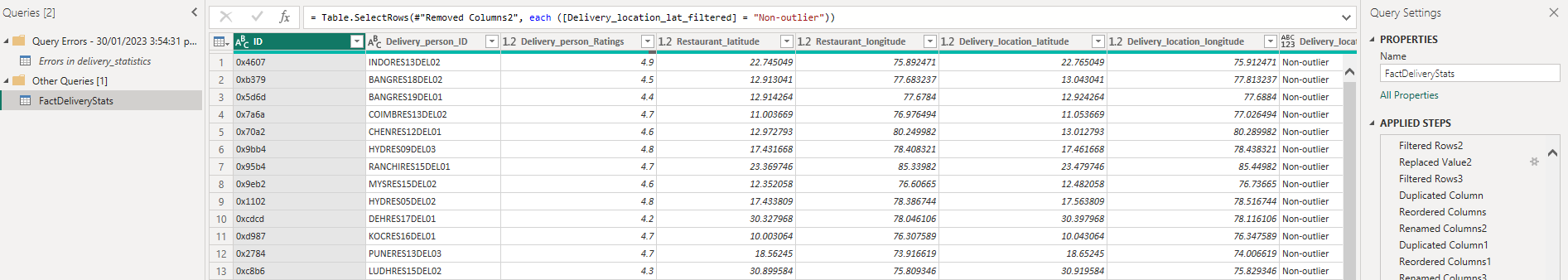
From there, the dataset was imported into Power BI and was transformed for data processing or cleaning. This includes simple tasks such as removing duplicates, removing unnecessary columns, replacing blank values as "No Data", and creating buckets.
Data Modeling
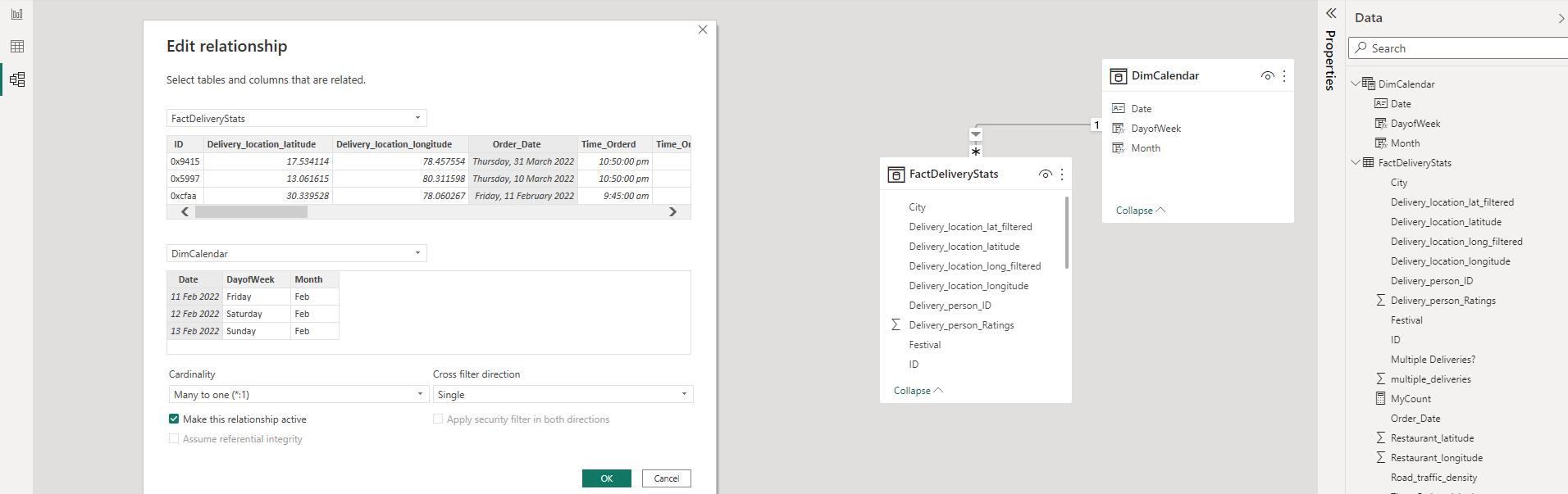
For data modeling, a dimension table was created solely for the timeseries. These tables were connected by "Order Date" from the Fact table and "Date" from the Dim Table.
These were the formulas used:New Table. Column 1: DimCalendar = CALENDAR(MIN(FACTTable.Column), MAX(FACTTable.Column))Column 2: DayOfWeek = FORMAT(DIMTable.Column, "DDDD")Column 3: Month = FORMAT(DIMTable.Column, "MMM")Column 4: Quarter = "Q"&QUARTER(DIMTable.Column)Column 5: Year = YEAR(Table.Column)
Dashboard Design
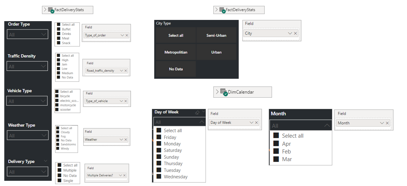
Below shows the visual elements in Power BI and the fields assigned to them.
Layout
Graphs & Cards
Filters